Rajat
Visualising The Central Limit Theorem With Gnuplot
14 MAR 2019 - 10 MINS
Gnuplot is a command line based graphing tool that has really stood the test of time. Three decades on it is still quite popular and commonly used in university maths courses for demonstrations. I was excited to get hands on with it and get a feel for what it is like.
Background: gnuplot
I am absolutely in awe of how well supported and feature-rich gnuplot is:
- it can export plots to a number of different formats (PNG, SVG, JPEG and even LaTeX)
- generate LaTeX snippets which can be included directly in a TeX file
- has APIs for every popular programming language (and also Haskell sigh)
After just scratching its surface, its influence on modern day graphing libraries, such as matplotlib in Python, are obvious.
I thought a nice example to explore some of gnuplot’s vast array of features would be to visualise the central limit approximation with it.
Central Limit Theorem
The CLT states that the mean of a sample of \(n\) independently and identically distributed random variables is distributed normally 1.
So take a random variable \(X \text{~} \textit{d}(\mu, \sigma^2)\), then the sample {\(X_1,...,X_n\)} is such that \(X_1 \text{~} \textit{d}(\mu, \sigma^2)\), \(X_2 \text{~} \textit{d}(\mu, \sigma^2)\) and so on. We can define the mean of the sample as being \(S_n = \frac{X_1 + ... + X_n}{n}\). Now I propose to you that \(S_n \text{~} \mathcal{N(\mu, \frac{\sigma^2}{n})}\) 2, which I will verify graphically below 3.
I won’t go into this in much more detail here.
Sampling with Python
I wrote a short Python script which does the following:
- Calculates the means of \(n\) samples taken from a Poisson distribution with a rate parameter of 5, where n = 1, 2, 5, 10, 50, 100 and 1000. Each individual sample has 100 points in it.
- From the list of the n means, we tabulate the number of times each mean occurs in the list i.e. the frequency of each mean in the list.
- Each list of mean-frequency pairs is then dumped into a separate file. Each file is in a format which gnuplot can interpret.
def generate_plotting_values():
    # Mean of the distribution
    sample_mean = 5
    # Size of each sample
    sample_size = 100
    # Number of samples
    sample_nos = [1, 2, 5, 10, 50, 100, 1000]

    for sample in sample_nos:
        # Initialise empty list to hold the mean of each sample.
        means = np.zeros(sample)

        for i in range(sample):
            # Generate 100 instances about a mean of 5.
            poisson_sample = generate_poisson_sample(sample_mean, sample_size)
            # Calculate the mean of the sample and store it in the list.
            means[i] = calculate_sample_mean(poisson_sample)

        # Tabulate the number of occurances (frequency) of each mean and
        # return this as a list of tuples :: [(mean, freq1)]
        freq_pairs = calculate_frequencies(means)

        # Write the frequency pairs to a file in the format expected by gnuplot.
        filename = f'{sample}_sample.dat'
        write_sample_to_gnuplot_format(freq_pairs, filename)
Refer to this gist for the full code.
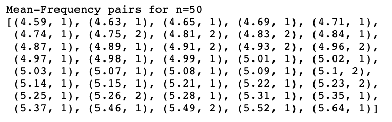
So when n = 50, 100 values are taken from the \(Poi(5)\) distribution 50 times. For each set of 100, the mean is calculated and appended to the list means (above). We calculate the frequecy at which each mean occurs and add each mean-frequency pair to a list. This list is then written to a file.
Visualisation with gnuplot
I then wrote some gnuplot graph specification files to plot the collected frequency data. The first one plotted each set of means on the sample graph. A Bezier curve 4 is used to plot a smooth line through the points.
It is quite clear that the mean approaches 5 as we increase \(n\).
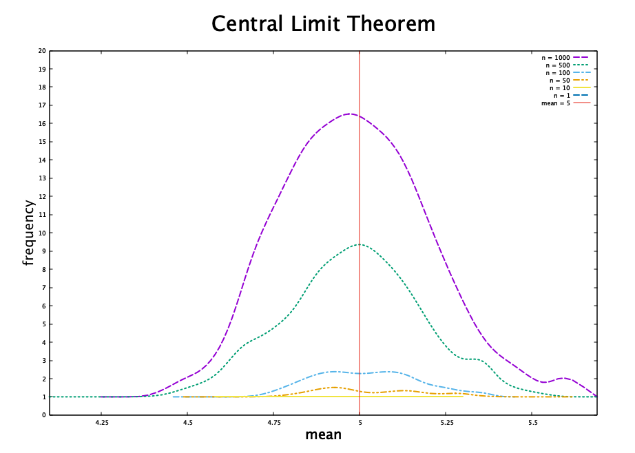
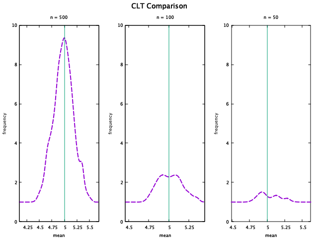
I also created a mutliplot to make the comparison more clear. The code for this plot can also be found in this gist.
-
This is a weak form of the CLT. There are many other ways of describing the CLT which are far more meaningful in practice. ↩
-
As you can probably tell, we can alter this derivation slightly and see that the sum of the \(n\) i.i.d random variables will also be normally distributed. ↩
-
There are many resources which much better describe how to prove the CLT. I have just stated it here so that I can get on with some coding. ↩
-
This curve gets its name from Pierre Bezier, a designer at Renault in the 1960s, who used this curve to shape the cars bodies. For more links click here. ↩
Did you enjoy this post?
If you did, check out my Github repo - I've got some cool projects on there. I also post these articles on Medium, so you could get notifications when they get posted if you download the Medium app and subscribe to my feed. Alternatively you could even subscribe to my feed on this site and get notified by my updates here. Add me on social media too. It's quite possible that you didn't like this article. I'd love some feedback!